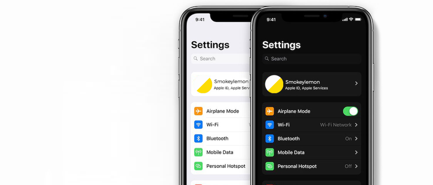
Dark mode is a light-on-dark color scheme, also called dark theme or night mode and it’s the latest trend on apps and websites. All the major operating systems—Android, iPhone, Windows, and macOS—now offer dark themes, which default to light text on a black background. Think of Spotify or Netflix, both use a dark theme and we LOVE them. Dark mode looks really cool, but is it actually better for your eyes?
Is dark mode better for your eyes?

When it comes to preferences, the Smokeylemon team is divided with 60% dark mode lovers and 40% preferring light mode. However, research indicates that in people without vision impairments, performance is better using light mode. See more pros and cons of each style:
|
Light mode
(light background, dark text)
|
Dark mode
(dark background, light text) |
|
Pros:
- In users with normal vision, light mode leads to better performance most of the time.
- Better for visual acuity(VA) tasks (like identifying shapes and gaps) and for proofreading tasks.
- The smaller the font, the better it is for users to see the text in light mode.
- With light mode, there is more overall light and so the pupil contracts more. As a result, there are fewer spherical aberrations, greater depth of field, and overall better ability to focus on details without tiring the eyes.
- During the nighttime, it is much easier for people to read the small-font text in light mode than in dark mode.
|
Pros:
- Longer battery life, as display emits less light than light-mode.
- As we age, the pupil decreases in size. Too small pupil sizes mean that too little light enters the eye, which impairs our ability to read or detect text, especially in low ambient light. We also become more susceptible to glare and dark mode helps with all of this.
- Good for people with visual impairments.
- Good for people with cloudy ocular media (various transparent substances in the eye, including the cornea and the lens) because the display emits less light.
|
|
Cons:
- There might be a long-term cost associated with myopia.
- Hard to read for people with cloudy ocular media (various transparent substances in the eye, including the cornea and the lens).
|
Cons:
- Harder to read for people with no visual impairments.
|
Sorry to disappoint you, dark screen lovers, out there!
In conclusion, if you don’t have a cataract or similar disorders, you should be using light mode to ensure the best possible visual performance on the screen.
So as you can see (pun intended) there is more to designing a website than good looks. If want to work with a web company that understands user experience get in touch with us.
*Source: https://www.nngroup.com/articles/dark-mode/


